Build Your First Excel Dashboard
What this covers
A complete walk from an empty Excel workbook to a finished sales dashboard: a live PivotTable of sales by product, a date timeline, a country slicer, a KPI strip with traffic lights, and a chart — all reading the Tessallite demo model, and all refreshable with one button tomorrow morning.
Before you start
- You need Excel connected to Tessallite over XMLA. If you have not done that yet, follow Connect Excel via XMLA first — it takes about five minutes — then come back.
- The examples use the demo workspace (
acme-demo) and itsmodelxmodel, which contains retail-style sales data. If your workspace has its own models, the same clicks work; only the field names change. - Role required: Analyst (Viewer) or higher.
The dashboard we are building
Meet Maya. Maya looks after sales reporting, and every Monday she assembles the same pack: sales by product, a trend over time, and the health-check KPIs her director watches. Today she builds it once in Excel, connected to Tessallite, so next Monday the whole pack refreshes itself.
The finished sheet has four parts:
- A KPI strip across the top: Net Sales, Revenue, and Gross Margin %, each with its governed traffic-light status.
- A PivotTable of Net Sales by product, trimmed to the top ten.
- A timeline and slicer so anyone can re-cut the numbers by period and country without touching the query.
- A chart that draws itself from the PivotTable.
Nothing is pasted. Every cell is a live view of the model.
Step 1 — Start the PivotTable from the model
- Open a blank workbook.
- Go to Insert > PivotTable > From External Data Source, and choose the Tessallite connection you set up earlier. (On some Excel builds this is Insert > PivotTable > Use an external data source > Choose Connection.)
- Pick the
modelxmodel when Excel asks which cube to use. - Excel opens an empty PivotTable with the field list on the right. The field list is the model: folders of dimensions (the ways you can slice, like
product_nameandcountry_code) and measures (the governed numbers, likenet_sales).
If the field list is empty, the model has not been deployed yet — ask your modeller. A model you cannot see is a model that is not published.
Step 2 — Sales by product, top ten only
- Drag
product_nameto the Rows area. - Drag
net_salesto the Values area. Excel fills in every product and its sales. - Now trim it to the leaders. Click the drop-down arrow on the
product_namefield, choose Value Filters > Top 10, and keep the defaults (Top 10 by net sales).
Here is the part worth pausing on: the Top 10 is decided inside the database, over every product the model can see, and only the ten winners are sent back to Excel. You are not looking at the ten biggest rows of whatever happened to fit on screen — you are looking at the genuine top ten. If you had instead hidden rows by hand, the subtotals would lie and tomorrow's refresh would quietly unhide them.
Step 3 — A timeline for the date range
- Click inside the PivotTable, then go to Insert > Timeline (on some builds: PivotTable Analyze > Insert Timeline).
- Tick the date hierarchy for
business_dateand click OK. - Drag the timeline handle to cover the period you care about — this quarter, say.
The moment you let go of the handle, every number on the sheet recomputes. Tessallite turns your drag into a date filter on the query itself, so the database does the narrowing — Excel never downloads the out-of-range rows at all. This is why a timeline over a hundred thousand rows still feels instant.
Step 4 — The KPI strip
Above the PivotTable, Maya wants the three numbers her director reads first, with their traffic lights.
- In the field list, find the KPI folder. Each published KPI — Net Sales, Revenue, Gross Margin % — appears with up to four members you can tick: Value, Goal, Status, and Trend.
- On a fresh area of the sheet, start a second PivotTable from the same connection. Tick Value and Status for the Net Sales KPI.
- The Value cell shows the headline figure. The Status cell shows
1,0, or-1— and because a real governed verdict sits underneath, Excel can draw the red, amber, or green icon over it. Right-click the Status cell, choose Number Format or use Conditional Formatting > Icon Sets, and the traffic light appears.
Two things to know about Status:
- It is the model owner's verdict, not Excel's guess. Green means exactly what the model owner decided green means — the same verdict shown on the Tessallite scorecard and in the Excel add-in.
- Status is model-wide. It cannot be broken down per product or per country — if you drop a dimension next to it, Tessallite politely asks you to remove the breakdown rather than repeat one overall verdict forty times. To compare regions, use the measure (
net_sales) and let the model owner define regional KPIs.
Repeat for Revenue and Gross Margin % and the strip is done.
Step 5 — Add the chart
- Click anywhere in the product PivotTable.
- Go to Insert > PivotChart and pick a bar chart (bars beat columns for long product names — the labels stay readable).
- Excel draws the top-ten products. Because the chart reads the PivotTable, it follows the timeline and slicer automatically. No re-pointing, ever.
Step 6 — A slicer for country, then arrange
- Click the PivotTable, then Insert > Slicer, and tick
country_code. - A tidy button panel appears. Click
USand the whole sheet — PivotTable, chart, everything wired to the connection — recomputes for US sales only. - Arrange the four parts on one sheet: KPI strip on top, chart beside the PivotTable, timeline and slicer along the left where they are easy to reach.
Save the workbook. Tomorrow, or next Monday, click Data > Refresh All. Every step you just did re-runs against the current data, with the same security and the same definitions everyone else's reports use. Maya's Monday pack is now a one-button job.
What Tessallite did while you were clicking
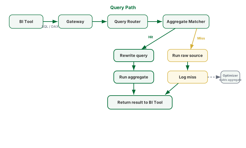
Every drag, filter, and timeline movement became a query against the semantic model — not against a copy of the data in your workbook. If a pre-computed summary (an aggregate) covers what you asked, Tessallite silently answered from it, which is why even the first drag felt quick. If not, the query went to the governed source path. Either way, the number is the same number your colleague in Power BI gets for the same question — that is the whole point of putting a semantic layer in the middle.
Good habits and common traps
Good habit: filter the period first. Set the timeline before you build the rest. Every later step then works on less data, so the whole build feels snappier.
Good habit: drill through instead of rebuilding. Double-click any PivotTable value cell and Tessallite returns the fact rows behind it on a new sheet — curated by the model, filtered by your security, and guaranteed to reconcile with the cell you clicked. Far safer than writing a second query by hand and hoping it matches.
Common trap: deleting rows by hand. Hiding or deleting PivotTable rows in Excel breaks subtotals and does not survive refresh. If you want fewer rows, use a Value Filter — it lives in the query, so it is still correct after every refresh.
Common trap: inventing a metric in the sheet. A Calculated Field is fine for presentation maths like margin divided by sales. But if the business needs a new number everyone shares — a blended margin, a growth target — ask the modeller to add it to the model. Then it is governed, reusable, and identical in every tool, not just in your workbook.
Troubleshooting
| Symptom | Likely cause | What to do |
|---|---|---|
| No models when choosing a connection | Nothing deployed in the workspace | Ask your modeller to deploy a model |
| Field list shows fields you did not expect | You are scoped to a different persona than intended | Personas shape what you can see; check with your administrator if something you need is missing |
| KPI Status cell is blank | The KPI has no target or bands to judge against | Use Value and Goal; ask the model owner to add bands if a verdict is wanted |
| Drill-through shows fewer rows than expected | Row security is filtering the detail | This is the security working, not a bug — the detail always matches what you are allowed to see |
| Refresh asks for the password again | The saved credentials expired | Re-enter your Tessallite password in the connection prompt |